I walked through the doors of The Spectrum three years ago as an assistant creative director. With less than a year of experience in graphic design, I was excited to start a real design position at a student-run publication. That excitement quickly dwindled as I worked alongside my superior.
The head creative director at the time did not like his job. He would constantly complain about the position’s many faults: the long hours, the last-minute projects, the unorganized staff, the drama. He never liked being in the office, and I could tell the position burdened his life rather than being an opportunity to learn.
I felt like another burden on his life.
He did not spend a lot of time teaching me anything. He would assign me an article to layout, and after an hour or so, I would submit my final layout to him. He then proceeded to change everything I worked on without informing me what I did wrong or how to improve myself for the future.
For many weeks, I would open the paper the day after production to see the layout I spent hours on not in print. I felt the hours of work I did on production days to be worthless and unsuitable for print.
My lack of experience and layout education from my superior later hit me in the beginning of the spring semester.
The night after production, my superior sent me a message on Facebook telling me he was quitting his job at The Spectrum to fulfill his dreams of being a Starbucks barista, leaving the role of creative director of The Spectrum to me. I felt overwhelmed. I did not know how to properly layout articles. I did not know how to make an infographic. I did not know how to fit all the content into the paper. I did not know how to resolve technical glitches and those were only the concerns I knew about.
There is more to laying out articles in a newspaper than most people would believe. The creative director needs to be a master at choosing the correct fonts for headlines and subheads, knowing proper hierarchy of information, piecing together content to fill in all empty areas of the paper, sizing and designing components to be clearly understood by readers, and overall designing the paper to be pleasing to read through. While on the job, you learn to overcome many challenges at last minute.
An editor may need an infographic the night of production, and you need to understand that information well enough to make it into a simplified version for everyone to understand at a glance. An article may be too short so you need to fill in the empty space with a photo. But wait! There is no good photo for that article so you need to either jump an article to that page or suffer with the empty white space.
Looking for a proper font for titles and subheads of articles can take up to an hour before you settle on a decent one. I felt there was something new for me to learn, a new challenge to overcome, every single production day.
I began to look at the paper as a giant puzzle: where the articles, graphics, images, titles, subheads and infographics are the pieces, and it is the creative director’s job to piece it all together.
Designing for a newspaper is its own challenge that no one can really understand unless they do it. It took me over two-and-a-half years to fully understand newspaper design.
From my minimal amounts of classes in my graphic design program, one of the things they never taught me was how to create pleasing layout design with limited amount of space for articles, images and graphics.
Most class projects would ask you to design a layout with all the content and graphics fitting the way you want it to fit. There was no supplied content that had to be implanted into your layout design. The project’s main goal was to make a superb layout by solely looking at it from a design standpoint.
From my work as creative director, I learned the freedom to design the way I want to was not how to best design for a newspaper.
In general, I think the hardest part about this position for graphic designers derives from a designer’s desire to produce whatever they want and making it look whatever way they want it to look. That is not how a newspaper needs to be designed. The articles are why people pick up a newspaper.
The tireless hours editors and writers spend researching and writing their pieces, sharing information with everyone is why newspapers and news organizations survive.
At the end of the day, design should always come second. Design should be used as a way for more people to pick up the paper that might not normally, but more importantly design should enhance an article’s meaning.
I have learned so much from working at The Spectrum. Even though the position of the creative director can be stressful, all those frustrations faced on a production day disappear when you pick up the paper the following morning.
My three years as creative director have been stressful and sometimes lonely. For the first two years, the only people the creative director would interact with were the editor-in-chief, the managing editor and on occasion a news or sports editor. Editors did not communicate with me.
The creative director works at times when most editors do not. In my first two years, Gabi, editor-in-chief, Alyssa and Tori, managing editors, were the few people I had the chance to converse with, and they made those 4 a.m. production days much more enjoyable.
Thankfully, my last year as creative director has been much less lonesome.
In this last year, I thought after five weeks into the semester I would be quitting and finding an internship. Thankfully, my supposed replacement at the time never came in for productions in the fall semester, leaving me in my position as creative director.
Inadvertently thanks to her, I had the best two semesters of my college career. Not only did I finally feel competent with my graphic design skills to produce the best content of my Spectrum career, but I met so many kind, ambitious, diligent, passionate editors who work hard to produce the best content.
Even with the bucket loads of stress, I would never trade this experience for anything else in the world. I cannot imagine spending a late Wednesday or Sunday evening without the wonderful people who work at The Spectrum.
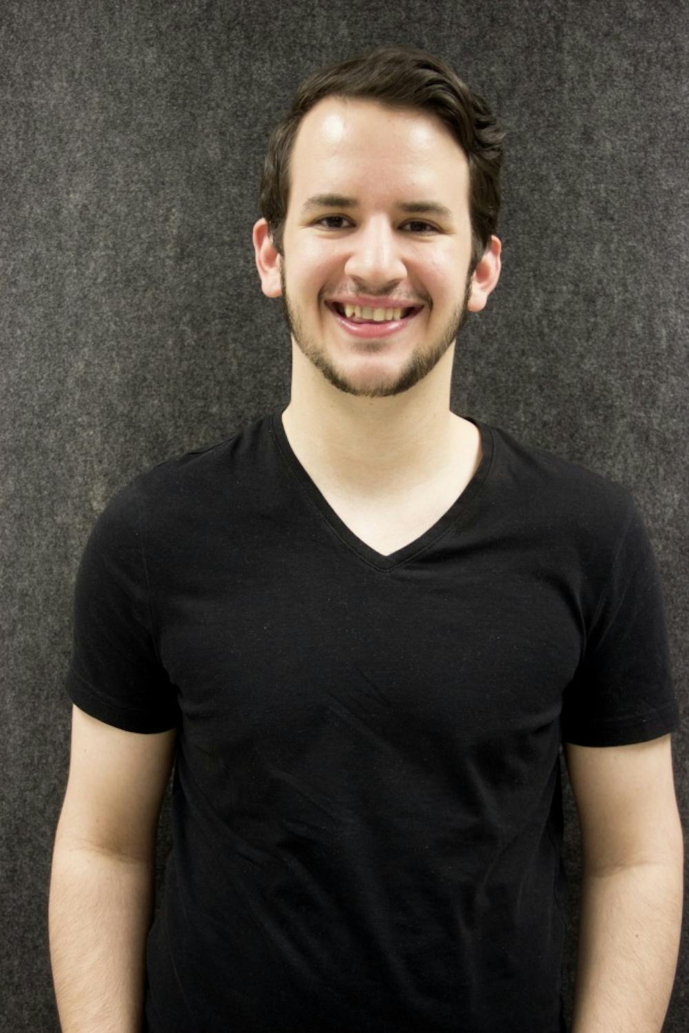
Pierce Strudler is the creative director and can be reached at pierce.strudler@ubspectrum.com.


