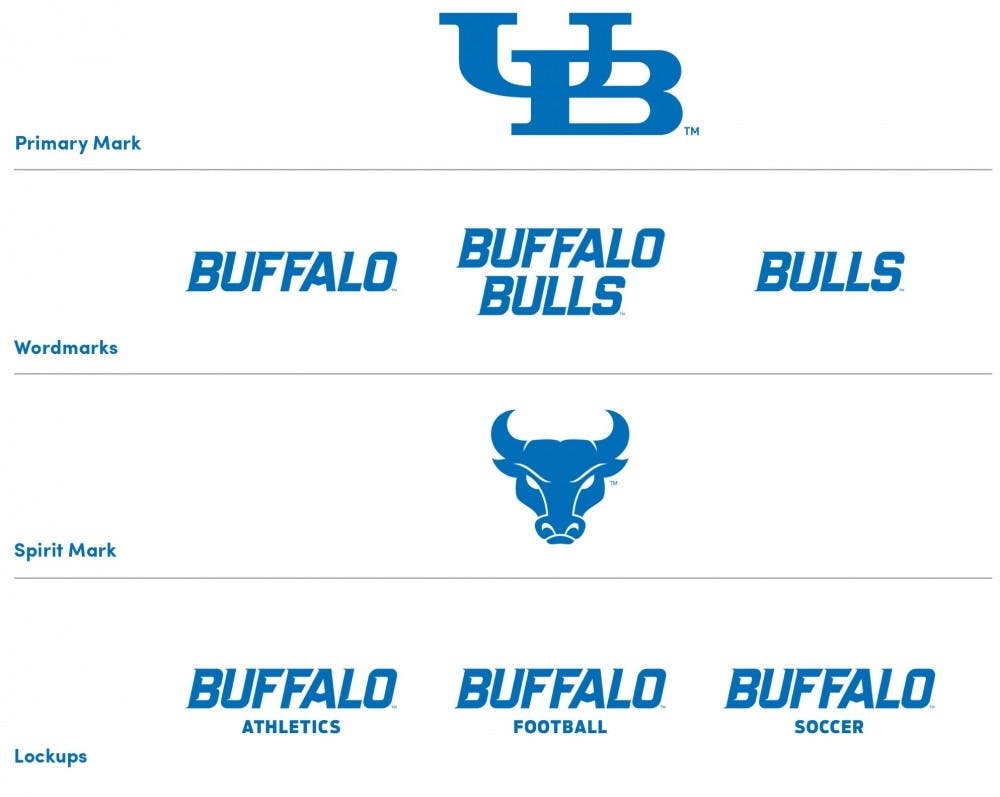
After nearly three years of major rebranding to jerseys, facilities and the overall athletics department, and some controversy among fans, UB’s sports teams will once again prominently feature the word “Buffalo” and not “New York.”
UB gave an update to its university-wide branding initiative Tuesday morning, which included the announcement that a new “Buffalo Bulls” wordmark will replace UB Athletics’ current “State University of New York Buffalo” wordmark.
The current watermark, which was implemented under former AD Danny White in 2013, put an emphasis on the word “New York” in large letters, with the word “Buffalo” small and barely visible underneath.
Current Athletic Director Allen Greene said the university and athletic department will work in cohesion with one another under the new branding initiative. He said the New York Bulls Initiative (NYBI), started by White to put emphasis on UB’s standing as the largest public university in New York, is no longer needed.
“The difference between a couple years ago and now,” Greene explained, “is that athletics was telling the story for the university. Now, the university is telling the story for the university.”
The university also announced a new primary logo and spirit mark for UB Athletics. The university’s traditional interlocking “UB” will serve as the sports teams’ and department’s primary logo, with a new spirit mark that serves as the first update to the charging bull logo since 2006.
UB Athletics will still put some emphasis on New York, as it will use the tagline “New York’s Public Powerhouse” in its future marketing efforts to promote UB’s status among public universities in the state.
Greene said the school is financially ready for the branding, but admits the process is “expensive and extensive,” as the “State University of New York Buffalo” mark is now featured on almost all apparel and jerseys and on the UB Stadium field and Alumni Arena court.
“We’re not just going to throw everything away,” said President Satish Tripathi. “The transition will be gradual. All of our letterheads and everything else is not going to go away in one day. We need to use what we have.”
Greene said whatever amount of money put into the “New York” branding through NYBI was not a waste, citing the five conference championships won by teams in the past two years. He said the investments were “wise” and “strategic,” and allowed Buffalo to be put in a “competitive perspective.”
Greene said implementing the “New York” mark throughout the athletics department the past three years was for the most part not “new expenses.” He said jerseys are replaced and the basketball courts get resurfaced every few years regardless of a logo change, and cited the fact that the UB Stadium turf needed to be completely redone in 2014 anyway due to damage from winter weather.
UB Athletics’ first order will be new jerseys for student-athletes and replacing the watermarks at the center of Alumni Arena and UB Stadium.
The current athletics’ wordmark was often a point of debate among UB fans, alumni, media and Buffalo residents, as some felt it shied away from UB’s location in the city of Buffalo and did not instill pride of their alma mater. Even some former student-athlete and UB all-time leading passer Joe Licata tweeted that he preferred the Buffalo mark to the New York mark on Tuesday.
Roughly a year ago, UB administrators sought out research and focus groups made up of people who have been associated with UB. Administrators asked six main questions, including what the names UB, Buffalo and New York meant to them.
“We learned when asked about the university name, it was overwhelmingly preferred to call it the University at Buffalo for the formal academic name than UB,” said Nancy Paton, UB vice president of communications.
Greene was on the original administrators committee and helped lead the branding effort when he was still deputy director of athletics under White.
Greene said White was engaged with the initial branding conversations and the affect it may have on athletics before he left UB to take the athletic director job at the University of Central Florida this past November.
Greene said he texted White Monday to let him know about Tuesday’s announcement. He said White told him “Whatever is in the best interest of the university, perfectly fine.”
“Not everyone fully understands that our sole purpose is to support the university,” Greene said, “and because [a few] years ago there was not a university-wide platform to tell our story, we felt we had no choice but to tell our story of UB from an athletics perspective and now we’re able to do it cohesively.”
UB Athletics has already begun some small changes to adhere to the new brand, like changing the heading on the UB Bulls website and its social media profile pictures to reflect the new wordmark and logos.
Editor's note: This story has been updated with new information and quotes from Athletic Director Allen Greene, Vice President of University Communications Nancy Paton and President Satish Tripathi.
Jordan Grossman is the co-senior sports editor and can be reached at jordan.grossman@ubspectrum.com. Follow him on Twitter at @jordanmgrossman.


